Maatlijn
A new identity and website for an architecture studio in Arnhem that designs homes for the landscape.
- Client
- Maatlijn Architecten, Arnhem
- Year
- 2026
- Services
- Brand identity
- Web design
- Frontend development
- Motion design
- Website
- Concept design
Maatlijn Architecten is a small architecture studio in Arnhem. Twelve architects, interior designers and building engineers design new homes, renovations, interiors and pavilions across the Veluwe and the river landscape around Arnhem. Most of their clients are private owners building the house they plan to live in for the rest of their lives, so the studio works slowly and personally. One architect stays with a project from the first walk across the plot to the day the keys change hands.
The studio has a clear point of view. A house should feel like it belongs where it stands, so the design starts with the site, the light and the view rather than with a style. Their buildings are quiet on purpose, with low roofs that cantilever over the ground, single columns, wood and stone, and windows that frame one view at a time.
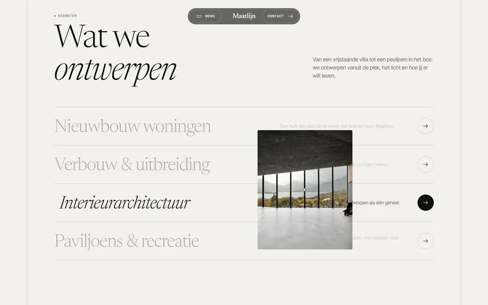
- New homes, renovations and extensions, interior architecture, and small pavilions in large landscapes.
- Four phases with one point of contact, from exploring the plot to weekly visits on site until handover.
- Clients who want to understand every step, including what each phase costs and when the next one starts.
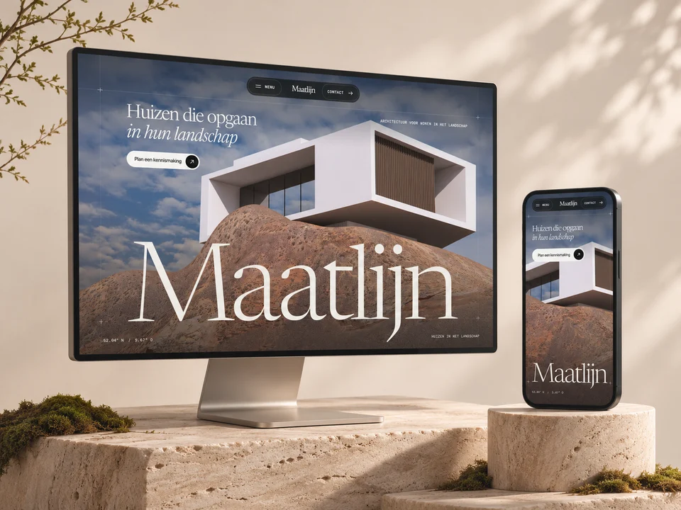
The studio had grown on word of mouth, with no real brand and a website that looked like every other architect's, a slideshow of renders and a contact form. That no longer fit. New clients arrived with questions the old site could not answer. How do you work? What does it cost? Will I still talk to the same person in a year? Maatlijn needed a name, an identity and a website that would answer those questions before the first meeting, and that would feel as careful as their drawings.
The brief came down to one sentence. Make the website feel like it was drawn by the same hand that draws the houses.
The name came first. Maatlijn is Dutch for the dimension line on a technical drawing, the thin line with two end ticks and a measurement in millimetres. It is the most modest element on a plan and also the one that makes it buildable, which is exactly how the studio sees its own role.
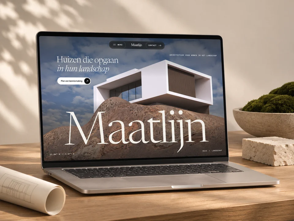
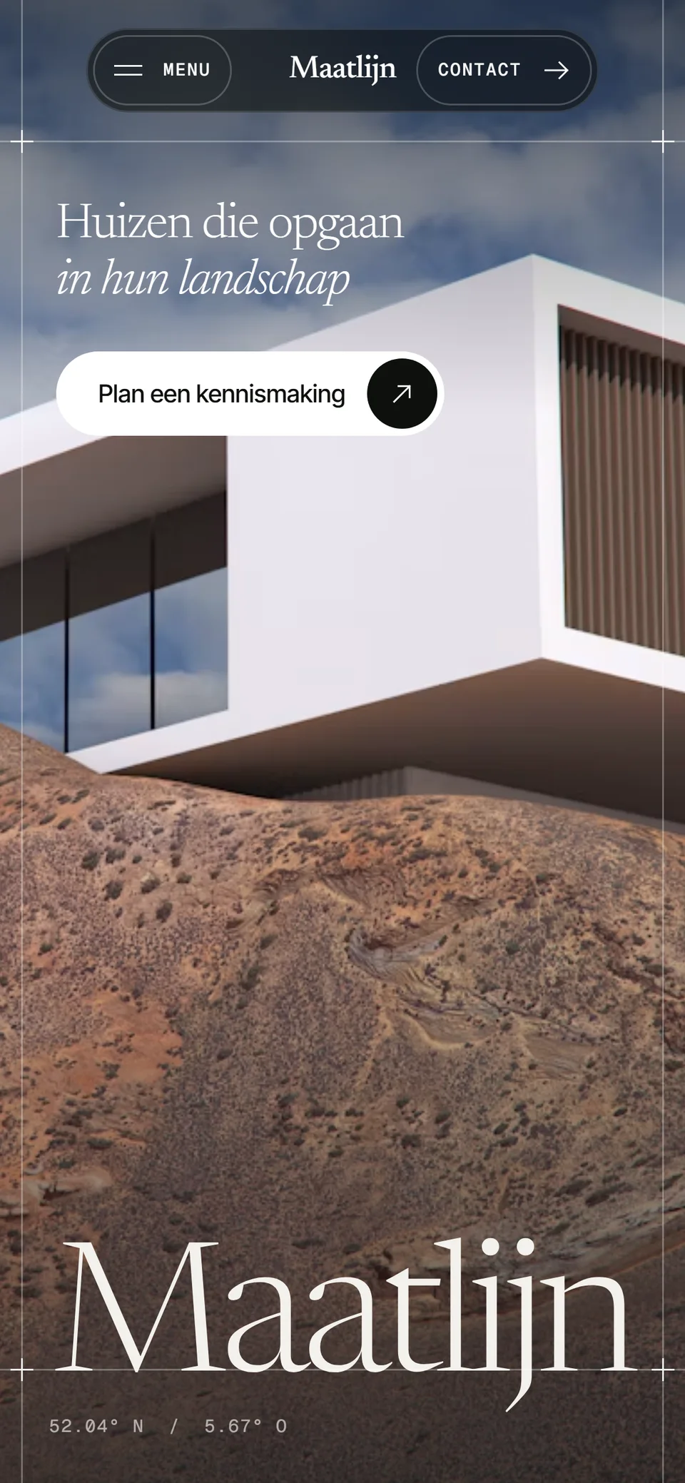
That line became the thread through everything, from the logo to the website. The mark is drawn with it, the business card and the site sign carry it, and on the website it turns into the grid you see. Two thin rails run down every section, rules mark where sections meet and a small cross sits at each junction, exactly like the construction lines on a plan. The big name on the homepage stands on one of those lines the way the house in the logo stands on its ground line. Wherever you meet Maatlijn, on paper, on a sign by the road or on a phone, it is recognisably the same hand.
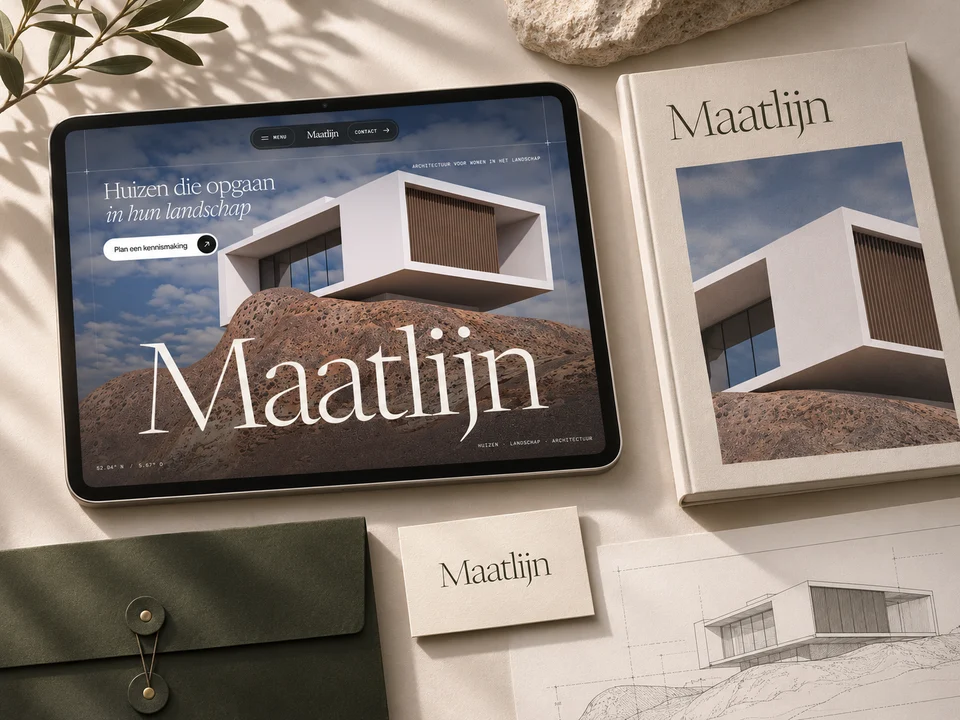
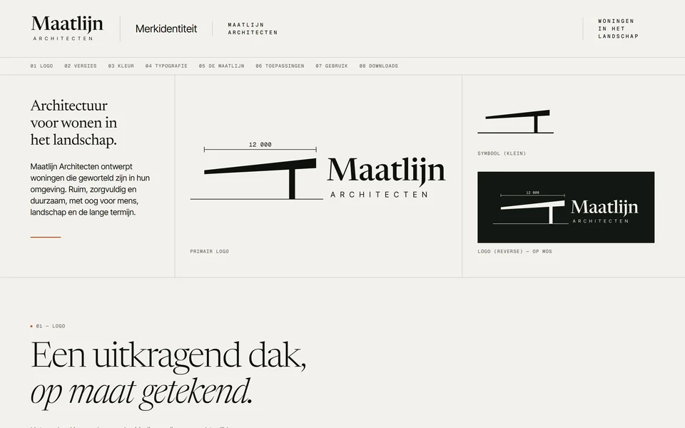
The mark is a section through a house. One tapered slab rises to the right, rests on a single column and cantilevers over the ground, with the dimension of the overhang drawn above it. The wordmark is set in Newsreader, with ARCHITECTEN standing on the ground line, and the colours come from the materials the studio builds with, paper, stone, terracotta, moss and charcoal. Every logo file is a traced vector generated from one set of measurements, so the business card, the site sign on the plot and the favicon in a browser tab are literally the same drawing.
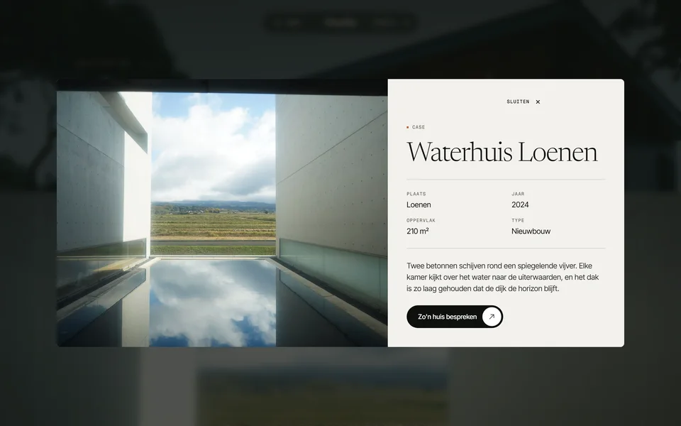
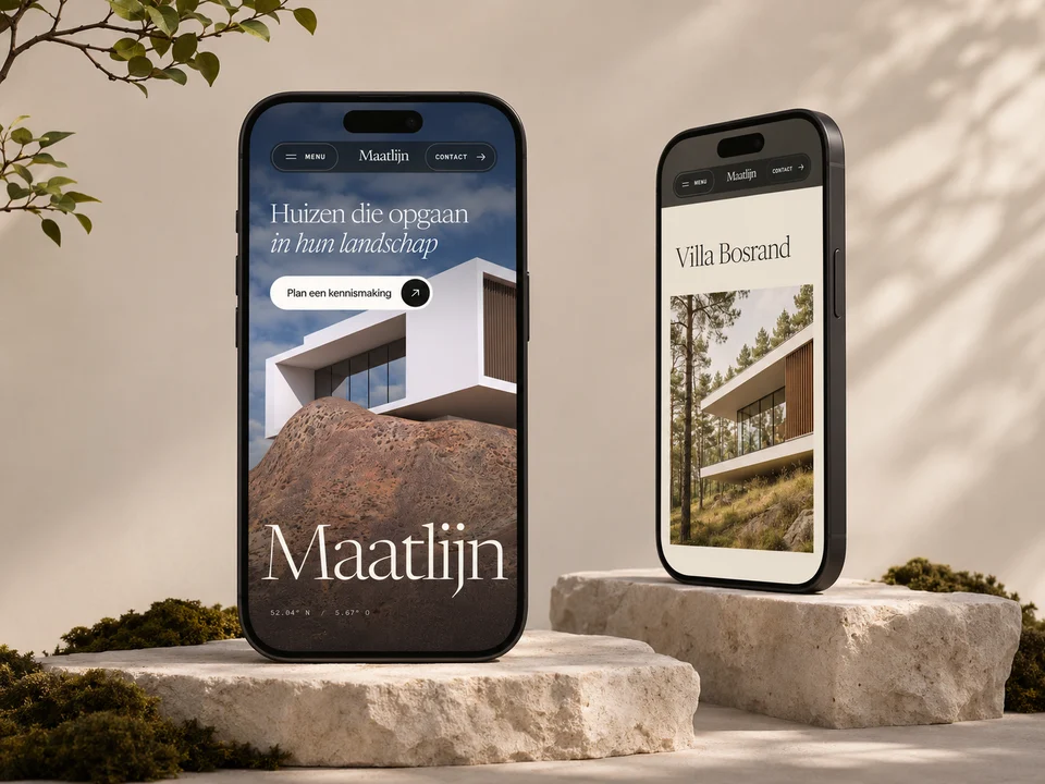
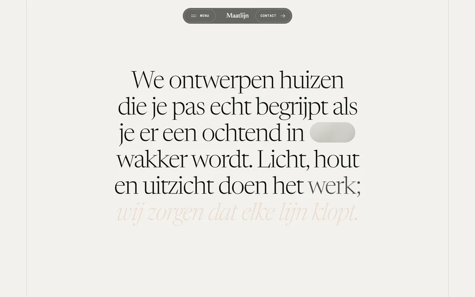
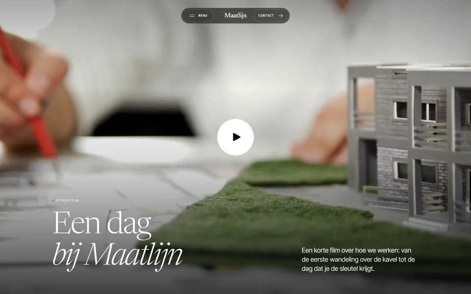
The website tells the studio's story in the order a new client asks their questions. It opens with who Maatlijn is and what they believe, then shows a short film of the studio at work. Selected projects follow as full screen panels, each one opening into a short case. After that come the services, the studio in numbers, the four phases from first sketch to handover with the time each one takes, and the words of a client. Every section ends close to the same invitation, to plan a first conversation.
Alongside the website there is a brand guide with the logo in every version, the colours, the typography and the rules for using the dimension line, and with mock-ups for the business card, project folder, letterhead, site sign and social posts.
- 1Drawing, logo to website
- 5Colours
- 17Logo files
- 4Phases explained
The motion is quiet and continuous, like walking through a house. The opening photo grows out of a small window while the name rises from the ground. The paper slides over the photo as you scroll, the studio film grows out of a sentence in one unbroken take, project panels stack on top of each other, and the menu does not take over the screen but grows out of the bar itself.
None of it gets in the way. Everything works with a keyboard, every animation steps aside for visitors who prefer reduced motion, text keeps its contrast on top of every photo, and the film only plays while it is on screen. The site is built with plain HTML, CSS and JavaScript, with Motion for the animation and Lenis for smooth scrolling.