Case study · 2026
Politie.nl (concept)
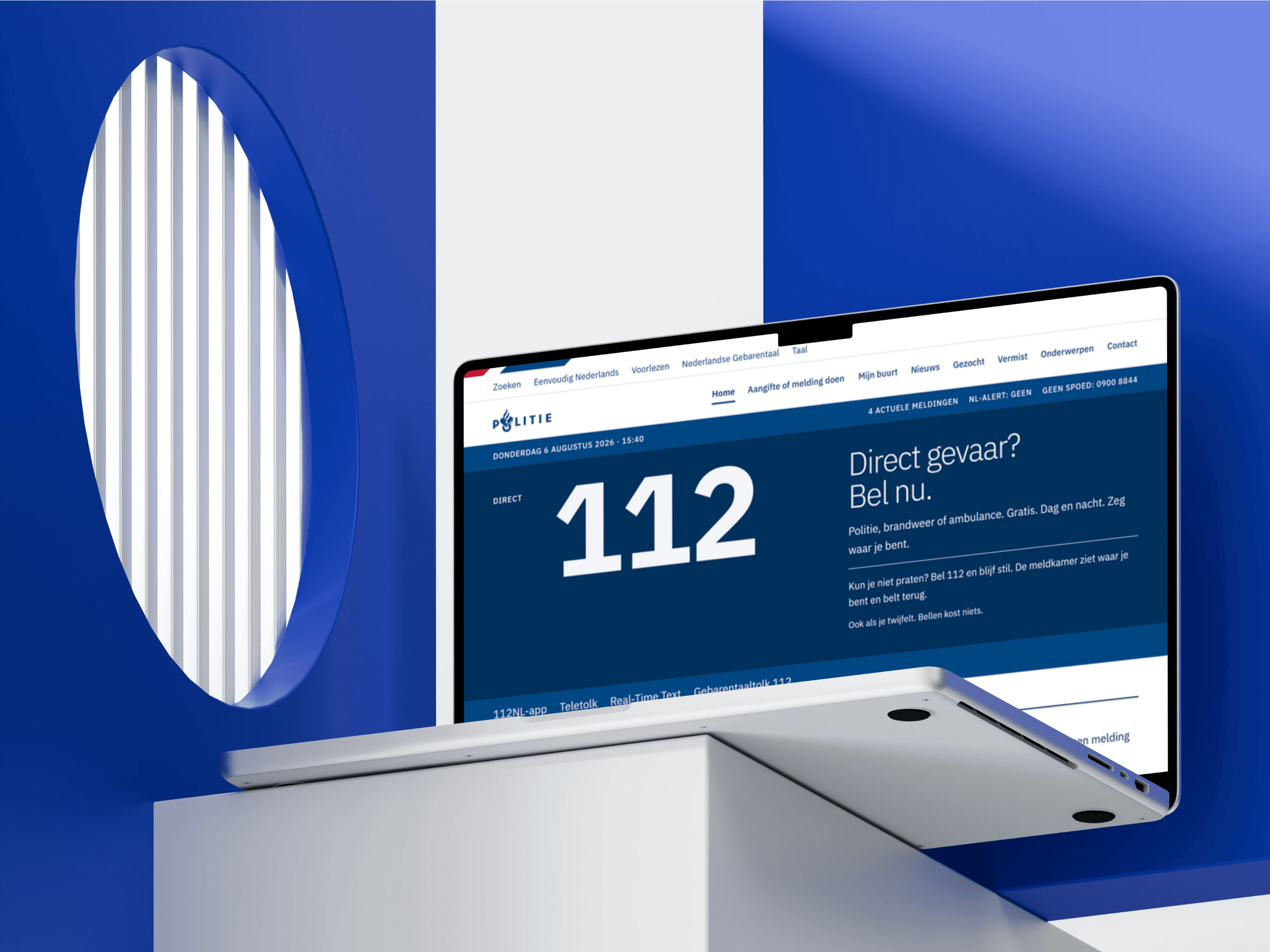
A self initiated design study, not commissioned by and not affiliated with the Dutch police. The question behind it: what would politie.nl look like if the whole site were treated as one public register, and if the crisis moment were designed first instead of last? Every screen is a working prototype filled with sample content.
- Role
- Concept, design and build
- Client
- Concept, self initiated
- Year
- 2026
What I did
- Concept
- Art direction
- Design system
- Frontend development
- Accessibility (WCAG 2.2 AAA)

The direction did not start in a design tool, it started with an AI assisted research pass. Seven sweeps covered international police and emergency services, public sector design systems, the crisis UX literature and the Dutch context, alongside a reconnaissance of the current politie.nl captured straight from its live DOM. Everything below points back to what that pass turned up.
- 7
- Research sweeps
- 51
- Sources cited
- 32
- Domains reviewed
- 22
- Crisis UX requirements distilled
Out of that came one idea, called Het Register. Every atom on the site, a report, a case, a news item, a topic, is a numbered, dated and sourced line with the same field order and tabular figures. On top of it sits one louder and rare layer: the urgency grammar Direct, Urgent, Informatief. The distance between those two layers is the design.
That choice came from scale. The real site carries thousands of wanted and missing person cases next to daily news and hundreds of topic pages. A register strip, six typographic lines without a portrait, can carry many cases at once where a wall of faces cannot.
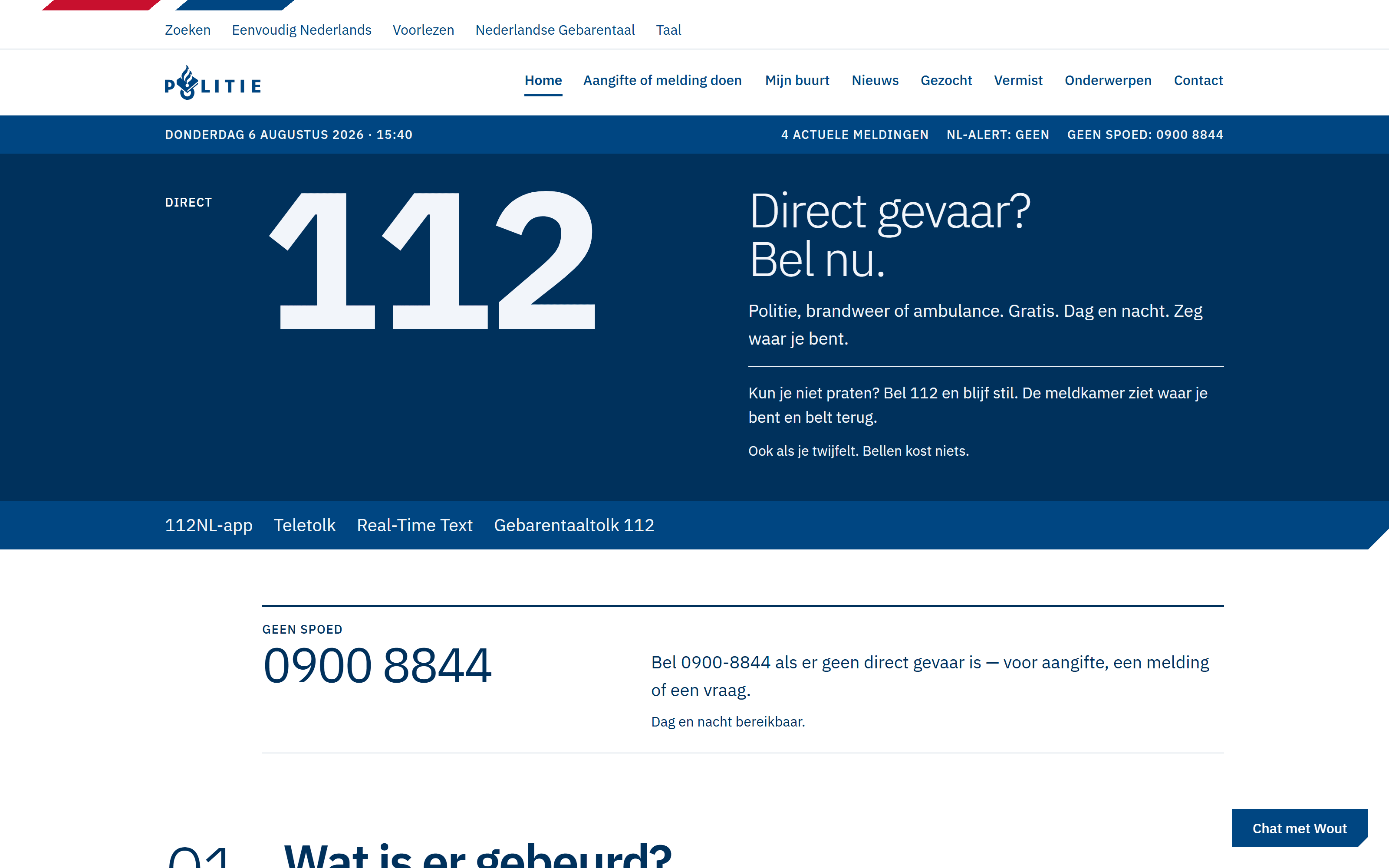
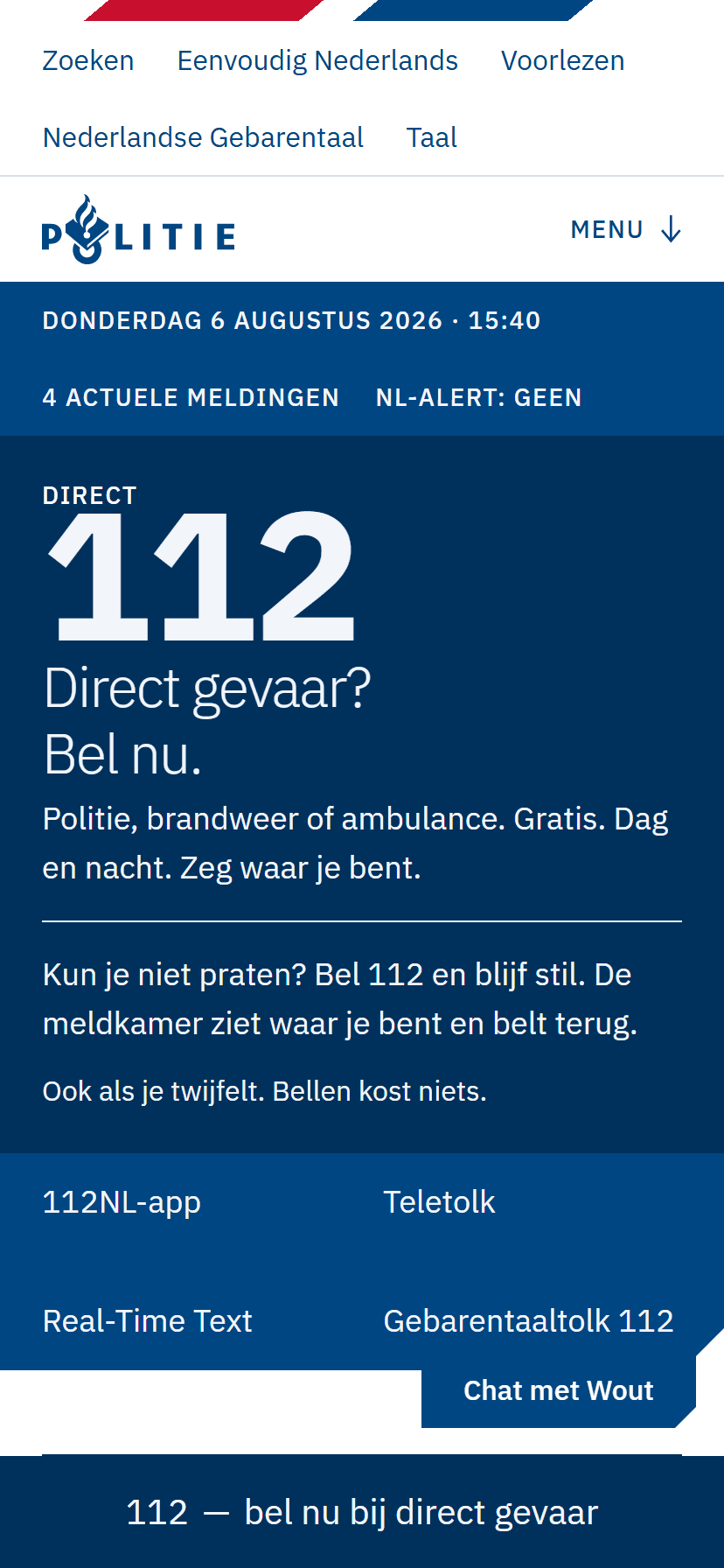
Accessibility drove the grid rather than following it. Contrast is verified by a script in the repository instead of by eye, the type scale is built to reach the AAA ratios, and the layout column matches the 44 pixel target size, so a control that fits the grid is large enough by definition. The emergency band with 112 sits above the wordmark, which makes the first thing in the document the thing you need when it matters.
It is a prototype, so there is no back end: all content is fixture data, and a permanent notice tells every visitor that this is not the real police website and that no personal details should be entered here.
- Gezocht (wanted)3,801
- Onderwerpen (topics)500approx.
- Vermist (missing)280
- Nieuws (news items)24that day
Why each change
- 01
FoundThe emergency numbers sit in a utility bar and are repeated in the footer, while the h1 is a time based greeting over a hero photo.
Changed112 gets a full width band directly above the wordmark, first in the document on every page.
WhyIn the moment someone actually needs the police, the first thing in the reading order should be the thing they need, not a greeting.
- 02
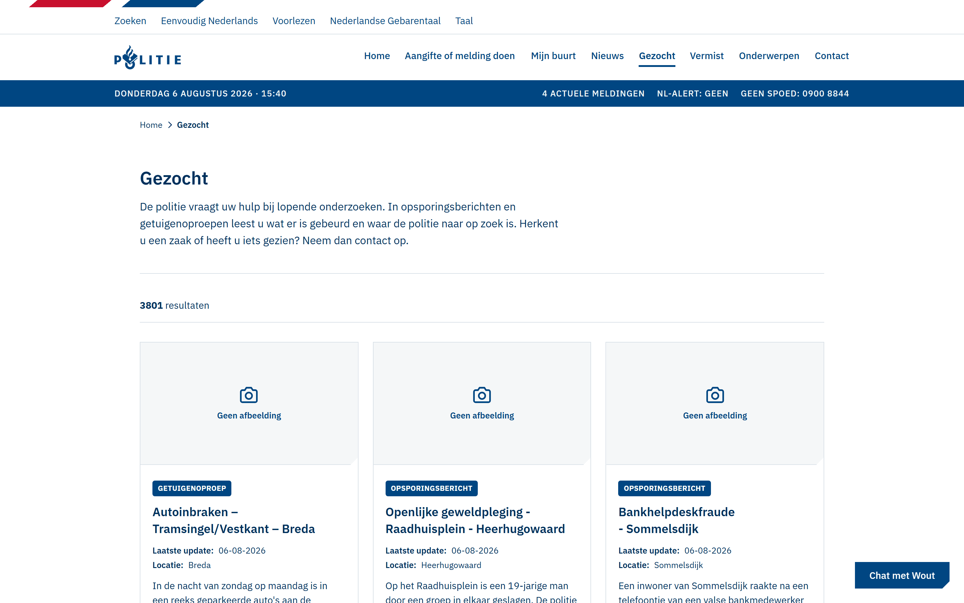
FoundGezocht carries 3801 cases and Vermist 280, all shown as photo cards, many of them with a 'Geen afbeelding' placeholder.
ChangedOne register line of six typographic fields, used for news, wanted, missing, unidentified persons and witness appeals alike.
WhyA wall of faces does not scale, and it fails hardest on exactly the cases that have no photo.
- 03
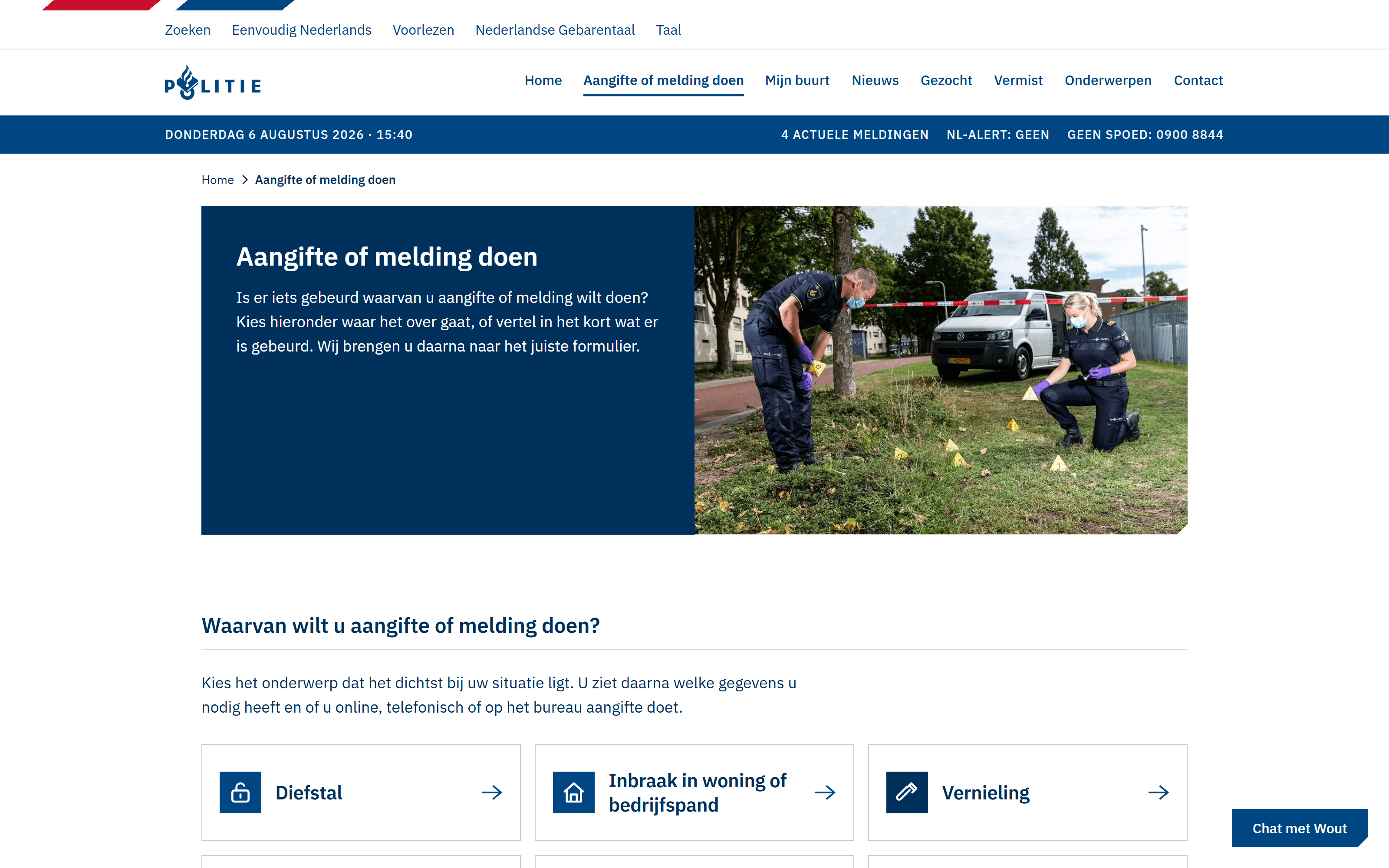
FoundThe reporting page jumps from h1 straight to h3, skipping a heading level.
ChangedOne numbered step sequence with a strict heading order, one question per step.
WhyHeadings are the navigation for screen reader users, so a skipped level is a broken menu.
- 04
FoundThe police accessibility statement targets EN 301 549 and WCAG 2.1, and says in its own words that the site is not there yet.
ChangedAAA contrast is the floor in this concept, and all 59 colour pairs are verified by a script that reads the real tokens from the stylesheet.
WhyContrast is the cheapest AAA level to reach, so it belongs in the build rather than in someone's judgement.
- 05
FoundTwo token generations still coexist in the live CSS, the legacy set next to the current huisstijl.
ChangedOne token set, no raw hex values in components, checked by that same script.
WhyDrift between two generations is what makes any contrast claim impossible to verify.
- 06
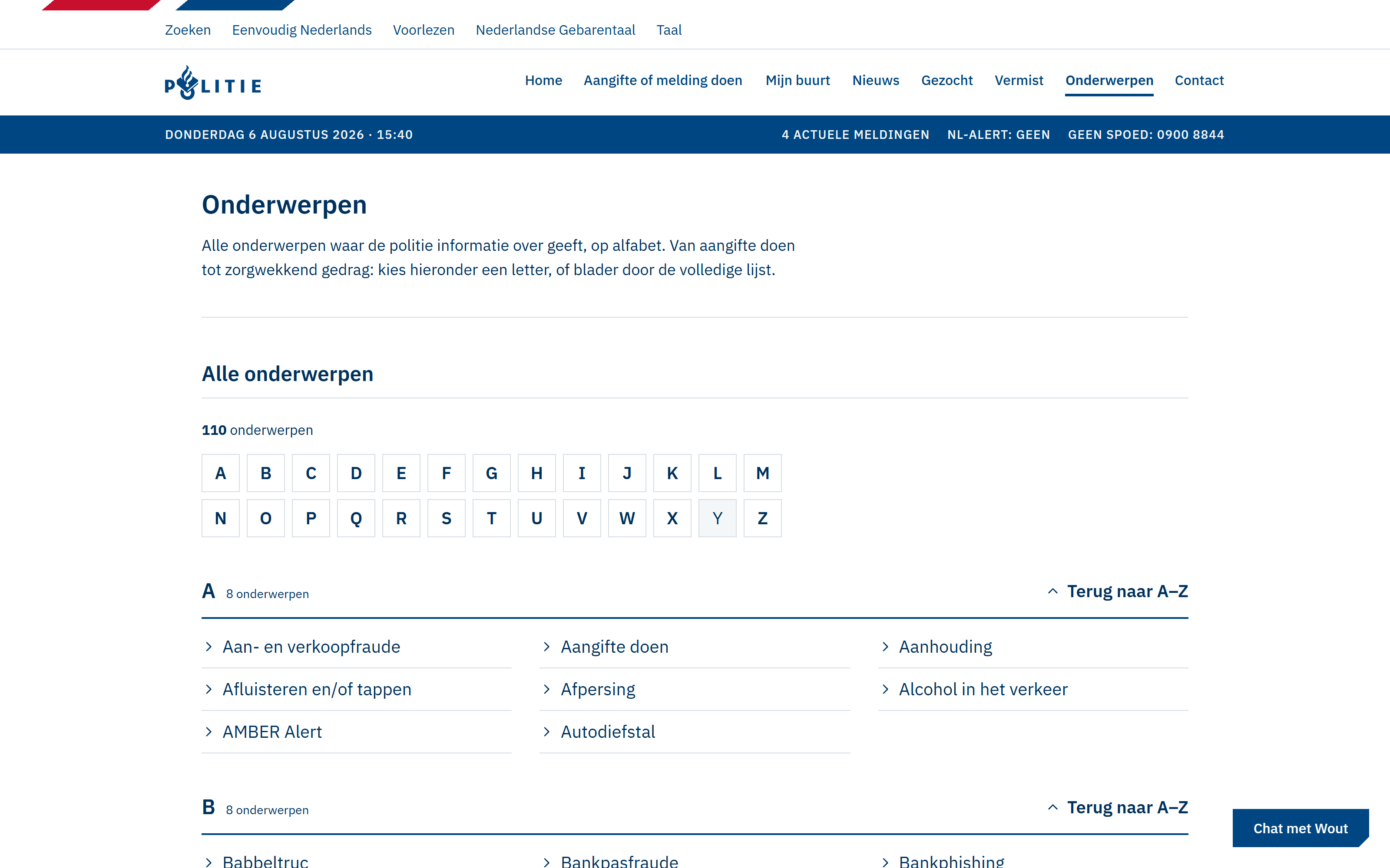
FoundOnderwerpen is an A to Z of hundreds of topics, with its own card and heading grammar per section.
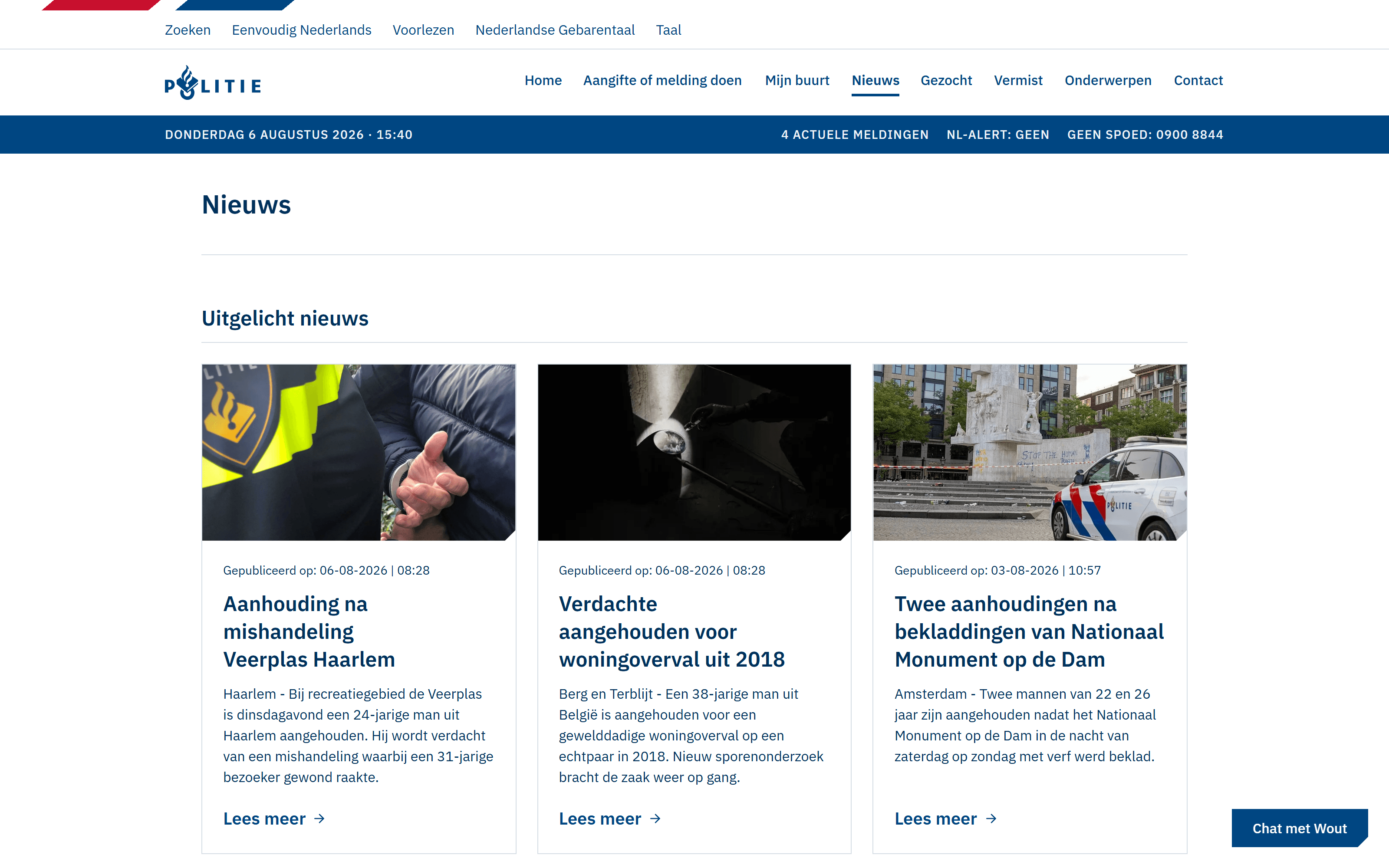
ChangedThe same register line carries the A to Z, the case lists and the news list.
WhyOne repeating format is what makes a long list scannable instead of exhausting.
Wanted: 3801 sample cases, carried by one repeating case card. News as a dated register rather than a magazine grid. Topics: an A to Z built to hold hundreds of pages.
- Body copy on the page13.18:1
- Headings on a tinted section12.26:1
- The 112 numeral on night blue12.06:1
- Links on the page9.55:1
- White on the primary blue9.55:1
- The 112 button label8.55:1
- Action text on an Urgent block8.26:1
- Validation errors on an Urgent block7.39:1
Dit is een zelfstandig ontwerp en geen officiële website van de Nederlandse politie.